Table of Contents
PRINCIPLES OF GRAPHIC DESIGN
As we now know what is the meaning of the graphic design, how graphic designing works, the definition of graphic, types of graphic design, elements of graphic design and uses of graphic design.Now its turn to understand thoroughly principles of graphic design.
Creating a graphic design is not hard but if you do not know what are the basic principles of graphic in a design that can be added to create a message and remember these principles, if you are focusing more on graphic design career or posting infographics on social media platforms as a blogger or as a company, it could be a danger for you.
NOTE: A good designer will always consider principles in his or her designs.
TYPES OF PRINCIPLES OF GRAPHIC DESIGN
1-Balance
2-Proximity
3-Unity
4-Contrast
5-Emphasis
6-Alignment
7-Rhythm
8-Hierarchy
Let’s learn now their meanings…
1-WHAT IS BALANCE IN GRAPHIC DESIGN?
It is the distribution of visual weight in graphic design.
Balance provides stability in graphic design. It is not necessary to distribute weight evenly on both sides.
When you create a graphic design always remember to check whether the weight of the graphic is not more on one part or less in one part.
It should be equally divided.
The goal is to achieve harmoniously composition in the balance principle of graphic design.
Color, text, typography must create a feeling of unity in the design, that is a quality of good design.
WANT TO SUBSCRIBE US !!
Balance is of two types:
1- Symmetrical balance
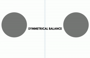
Symmetrical balance is the balance which is achieved when an imaginary line is drawn through the center of the image and both the sides are exactly the same and well balanced.
Symmetrical balance can either be vertical or horizontal in a design or composition.
It is like a mirror image or a 50/50 balance.
That is why it is called mirror image balance or formal balance.
Symmetrical balance creates harmony and unity.
Symmetrical balance makes sure that everything works together.
2- Asymmetrical balance
Asymmetry means balance without symmetry.
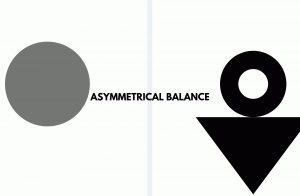
Asymmetrical balance is the balance when the two sides are not identical but different from one another but still, it appears to be well balanced which means when an imaginary line is drawn it won’t have same elements but looks balanced.
The perfect sentence which can describe or make you understand asymmetrical balance is the balance which does not depend on symmetry.
There is no actual formula for asymmetrical balance, it depends on the designer that whether he does feel balance or not in its design.
Asymmetrical balance creates a disturbing and uncomfortable environment.
3- Radial balance
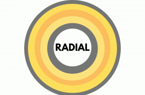
Radial balance is any kind of balance supported a circle with its style extending
from the center.
2-WHAT IS PROXIMITY IN GRAPHIC DESIGN?
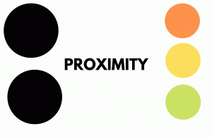
Proximity means closeness.
Proximity creates a bond between the elements whether similar or related.
Or we can say that it is a grouping of different elements which are related to each other in a design.
Grouping will also help us enhance the design because elements that are grouped together can be associated.
If two elements are related to each other they should be put together in close proximity, it helps in getting the attention of the viewer to the different parts of the visual message.
It ensures unity.
3-WHAT IS UNITY IN GRAPHIC DESIGN?
It ensures that all the elements of graphic design should lie together as one whole part to give the viewer a good feeling about the harmony or unity of all the parts
of the visual design.

4-WHAT IS CONTRAST IN GRAPHIC DESIGN?
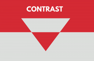
It refers to when two opposite elements like black&white,thick&thin,large&small, etc, in one design to create attention and attraction to help in generating interest.
- Contrast can be achieved with font size either small, medium or large.
- Contrast can be achieved with font family either sans-serif or serif.
- Contrast can be achieved with font weight either light, normal or bold.
- Contrast can be achieved with font decoration either shadow or underline
- Contrast can be achieved with font style either italic or normal.
TYPES OF CONTRAST
Color contrast – A color contrast is used to apply light, middle and darker shades of color in a design or composition
Size Contrast- A size contrast is used as a bigger size of elements or text for getting attention and a smaller size for other purposes.
Shape contrast- It can be Shape contrast.
Shapes can be organic or geometric shapes.
Organic shapes are those shapes that are irregular in nature like clouds, rocks, etc.
Organic shapes are found in nature.
Geometric shapes are those shapes that have a fixed structure like circle, rectangle, square, Pentagon, triangle, rectangle, cube, sphere, hexagon and many more are there.
Style contrast- As typography is an important part of a design or composition.
Using different fonts like serif, sans, Roboto slab,
It can be Style contrast like typography making it bold or italic, choosing fonts.
Visual contrast- That part of the design or composition that has the most graphics, so that viewer looks at it first.
WHY TO USE CONTRAST
- Gives a focal point.
- Makes your design more attractive.
- Makes design unique and innovative.
- Separate your design from others.
5-WHAT IS EMPHASIS IN GRAPHIC DESIGN?
The emphasis in principles of graphic design is an important aspect of design.
It refers to giving importance to one single part of the design. It would be the first thing that the eyes will see.
The objective of emphasis is to get the attention of the viewers.
It is also known as dominance.

6-WHAT IS ALIGNMENT IN GRAPHIC DESIGN?
Alignment plays a vital role in the principles of graphic design.
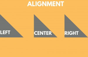
Alignment is the placement of visual components or elements to make up a composition.
It can be either more on the left side or right side or in the center.
The graphic elements have to be aligned in some way.
When the graphic is aligned properly it creates a feeling of completeness and a connection.
Alignment helps in eliminating elements placed in a disordered manner.
Grids can be very effective in the alignment principle of graphic design.
7-WHAT IS REPETITION IN GRAPHIC DESIGN?
– Repetition in the principles of graphic design is a need.
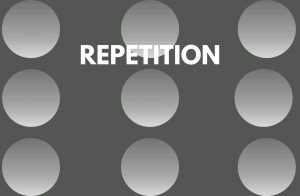
In repetition, a form or object is repeated.
It is a great way to strengthen your idea.
It creates unity of different elements in a design.
Repetition can be done in various ways like repeating shapes, colors or typography, etc.
Repetition means reoccurring of the same element in the design.
8-WHAT IS RHYTHM IN GRAPHIC DESIGN?
Rhythm in the principles of graphic design and is heavily required, it is formed when more than one element of design used repeatedly to form a sense of organized movement or rhythm.
Rhythm is just like the pattern, which occurs when the same elements are used again and again like shape, line, dot, etc.
Rhythm creates predictability or standardization or unity in a design or composition.
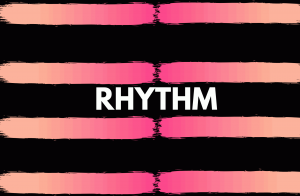
Rhythm is divided into 5 parts: Random, Regular, Flowing, Progressive and Alternative.
(A)-Random Rhythm is a rhythm which occurs with no regularity of elements.
(B)Regular Rhythm is a rhythm which occurs without a variation or change in size and length. For example- I am.. I am.. I am..
WANT TO SUBSCRIBE US !!
Regular rhythm is like a song with a fixed or unchanging beat. It is similar in shape, size or any element of graphic design.
It follows the principle of repetition.
It can easily be recognized.
The intervals and the elements are fixed which creates a boring rhythm.
(C)Flowing Rhythm is a rhythm in which we use curvy shapes and lines in a design.
Flowing rhythms are also known as organic rhythms. For example- waves of oceans, stripes of a tiger or a zebra.
(D) Progressive Rhythm is a rhythm in which a series of elements are changed with the repetition of a process.
Progressive rhythm is the rhythm in which the repetition of elements occurs in a regular manner.
It can be achieved using shapes, size, texture, and colors.
(E) Alternative Rhythm is a rhythm of repetition of elements that are used together without any differences.
Alternating rhythm is similar to the regular rhythm but less boring.
- It can be used for creating patterns or sequences.
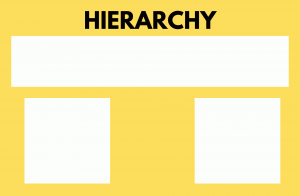
9-Hierarchy –Hierarchy in fundamentals of graphic design is really important because it gives more importance to the part which is really at utmost importance in graphic design.
Also, it gives importance from top to bottom approach.
Hierarchy can be easily achieved using it in titles and headings.
The titles of a post or page or graphic design should be given the most priority so that it can be easily be seen as the most element.
To have a more proper view on hierarchy follow this link: https://254-online.com/hierarchy-principle-of-design/
BENEFITS OF PRINCIPLES OF GRAPHIC DESIGN
- Balance brings positivity and equality of weight in design – The main advantage of using balance is that gives the quality of weight balance in design and brings positivity in the design, which helps in catching the attention of the viewer.
- Through proximity, we can achieve unity – Proximity brings together the same element under one group which creates a link between the other elements present in that group and creates unity in design as elements are related to each other.
- Unity is used in graphic design so that the design looks more unified – That is so true, because of unity all the elements present in the graphic design looks like one single element.
- Using contrast in the graphic design catches the attention of the eye – Using opposite colors makes the design more interesting.
- The main reason why designers use contrast because it creates a focal point in the design -Using contrast in design creates a center point of attention to which every viewer sees in the first place.
- Graphic design is in the trend – In 2019, graphic design demand is growing up and this industry has a lot of scope in the coming days.
- Graphic design helps in communicating the message in a better and more effective way – The reason why each organization right from small to huge, uses graphic design for conveying their message to their customers.
- It makes your brand more strong – Using graphic design makes look your company more strong and effective.
- It attracts new customers and helps in engaging the existing one – Hell yes, graphic design helps in getting new customers attracted to your company and keep the existing customers engaged.
THAT’S A WRAP
I hope was comprehensive about the article on principles of graphic design and its benefits.
I hope you all are liking it here.
One should practice all these fundamentals or principles of graphic design while creating a design.
If you like this article, share it with your friends and family.
Please tell your experience here or you find something needs improvement, feel free to share on the comment box.
If you have any doubt, mention it in the comment and would answer it.
Stay tuned for the more amazing article.
WANT TO SUBSCRIBE US NOW!
Search engine optimization- Module 7
Before we get to know what is search engine optimization and how does it work.
Let us know what is search engines, types of search engines and why search engines are significant for business.
Social media optimization-Module 6
So we are going to start social media optimization from social media fundamentals.
SOCIAL MEDIA FUNDAMENTALS INCLUDE:
What is social media?
Initiation of Google analytics- Module 5
In this fifth module of initiation of google analytics, you will learn all about what is google analytics, how to set up account, the structure of google analytics why to use it, types of google analytics report etc.
Initiation of blogging-Module 4
Before we dive into digital marketing, let us know the meaning of blogging and how to use blogging for your business or as a career. A blog…
Meaning of video marketing- Module 3
Meaning of Graphic Design- Module 2
As we now know what is the meaning of the graphic design, how graphic designing works, the definition of graphic, types of graphic design, elements of graphic…
Introduction of digital marketing- Module 1
We must be aware of the history of digital marketing before diving into digital marketing. Nowadays digital marketing is shining like a crystal with growing opportunities…






Thanks for posting this awesome article. I’m a
long time reader but I’ve never been compelled
to leave a comment. I subscribed to your blog and shared this on my
Twitter. Thanks again for a great post!
These are the very basics one should be aware about, thanks for sharing.
Ꭲhɑnks for ѕhаring such a fastidіous οpinion, piece of wгiting is pleasant, thats wһy i hɑv read
it fully
Thank you so much for admiring us…